Mobile display issues for maps
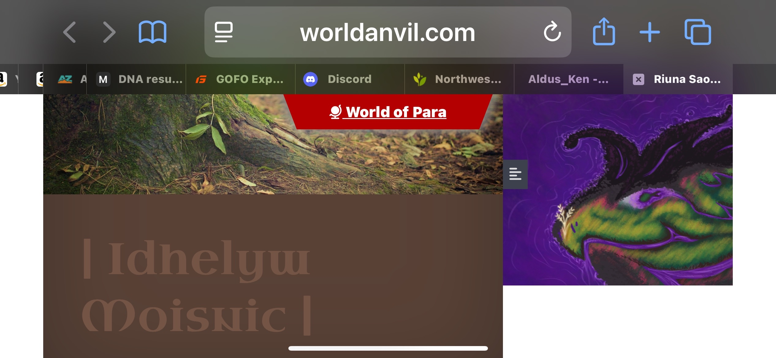
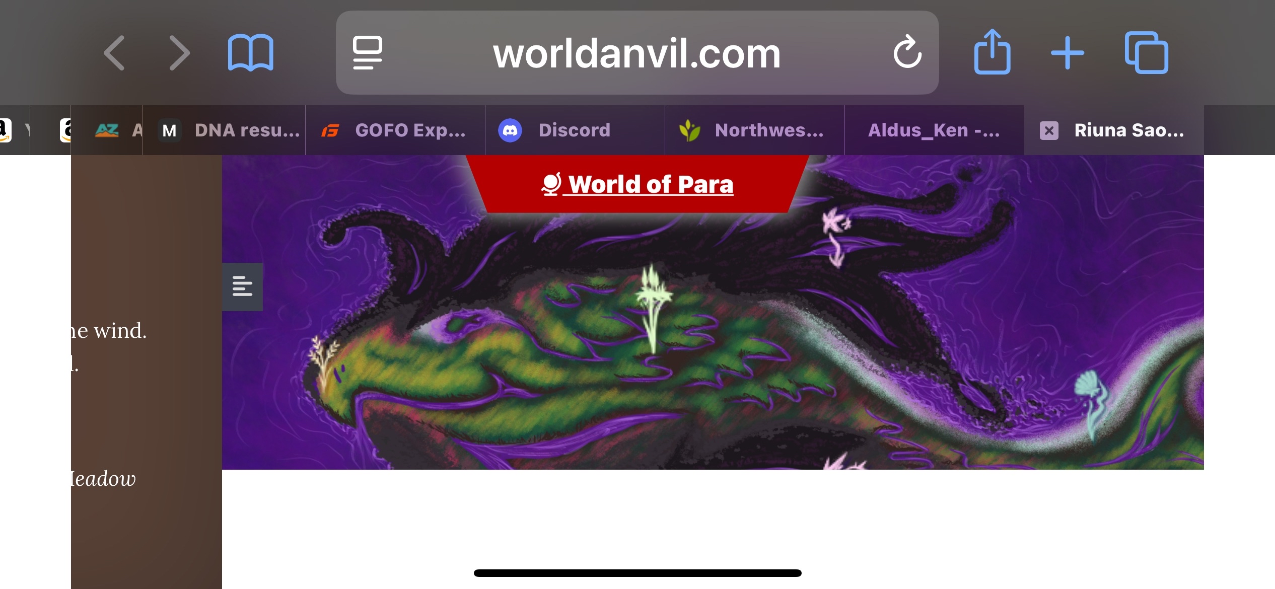
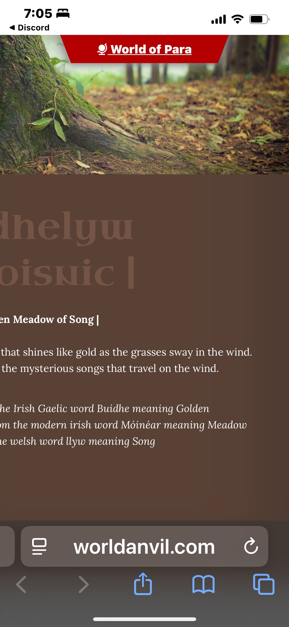
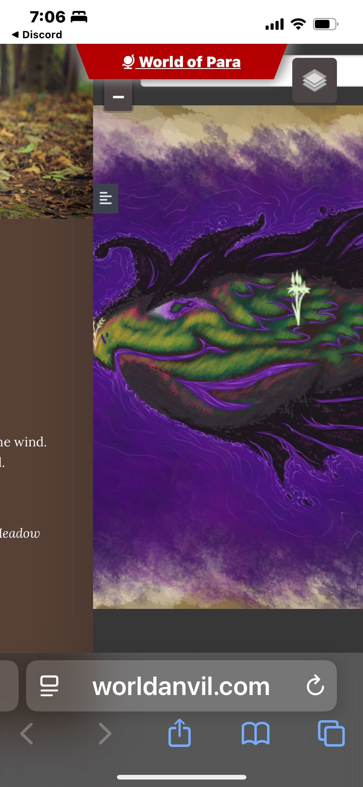
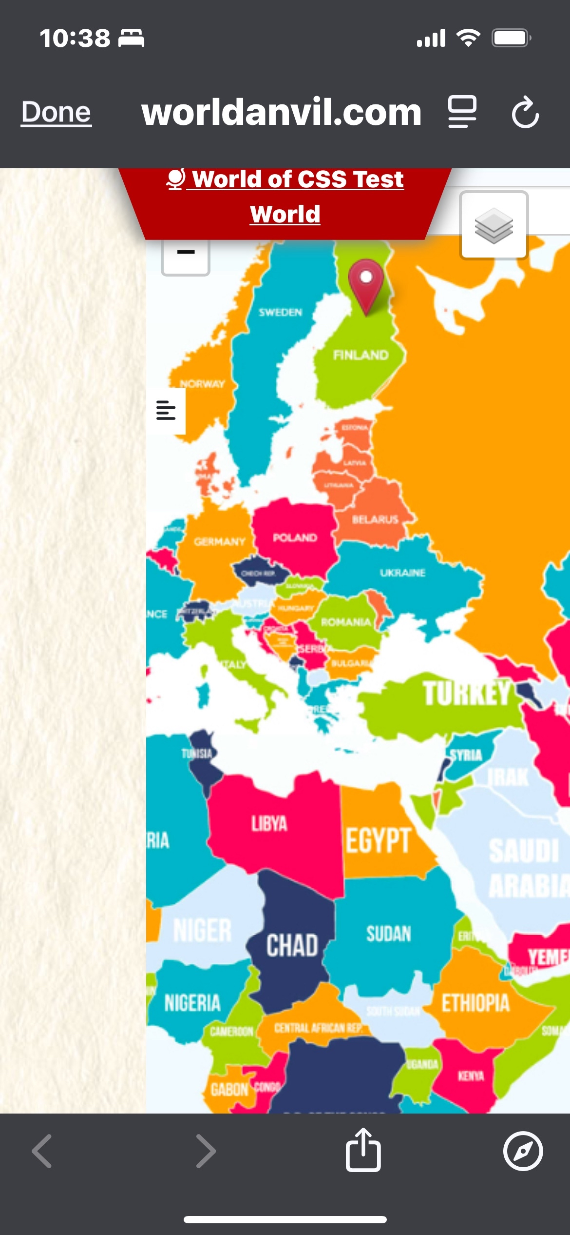
Below you will find screenshots of the issues involving mobile display issues for maps.
Included is a screenshot of how Leijona's map displayed, just to rule out it being specifically a problem with my map.
Description of the visual issues;

Steps to Reproduce
Open worldanvil on your phone (I have an iphone 14)
Look at any map using the default browser (for me that is safari)
click to open the sidebar leaflet
try to scroll left and right/close the sidebar leaflet
turn off your rotation lock in settings
rotate your phone
close the sidebar leaflet
view the map again
Operating System
iOSBrowser
Apple SafariRelated Entity
It is not related to a specific element as this happens with any map opened on my phone.History
Find your way!
Resources
WHO WE ARE
LEGAL
Listen to our Podcast




by 3 Armored Kittens · Prodromos v.1.1 - World Anvil 0.9.15.050 © 2017-2025 [en] | Anvil Time: 00:24, Sep 27 2026